Improve the Use of Images
This guide is available as a Word document or PDF.
When incorporating an image into educational material, the first step is to evaluate whether the image is relevant to the learning objectives and has non-redundant information. Having decided to use an image, there are additional details to think about to improve communication through the image. The self-explanatory aspect of each image is especially important in Open Learning because students navigate the educational materials on their own, with minimal guidance from an instructor to interpret each image.
Integrating Text With Image
Instructional split-attention occurs when learners have to mentally integrate information that is presented disparately in space (or in time) (Ayres & Sweller, 2021). If multiple sources of information are unintelligible in isolation, then there is split-attention (Ayres & Sweller, 2021). The split-attention effect is detrimental to learning because mentally integrating information consumes cognitive resources (Ayres & Sweller, 2021). The spatial contiguity principle suggests that we can minimize the split-attention effect by putting text and images close together (Ayres & Sweller, 2021).
Separating an image from the relevant information in the main text can be a form of split-attention. Consequently, students may need to look for connections back and forth between the main text and the image in order to integrate the disparate sources of information (Fiorella & Mayer, 2021). Therefore, in the course reading, the image should be in spatial proximity to the location in the main text where the image is discussed.
The figure caption is another way to bring together text and visual information. In fact, BCcampus requires detailed captions for all images. The caption field houses the textual information that is needed for interpreting the image but is not relevant enough to the overall lesson to be in the main text.
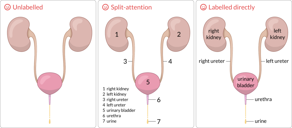
Text and image can be brought even closer by physically integrating words and graphics together, such as in the form of a labelled diagram (Fiorella & Mayer, 2021) (Figure 1). Put the label close to the relevant part of the picture to help learners hold both the textual and visual representations in working memory and build text-visual connections (Mayer, 2021).
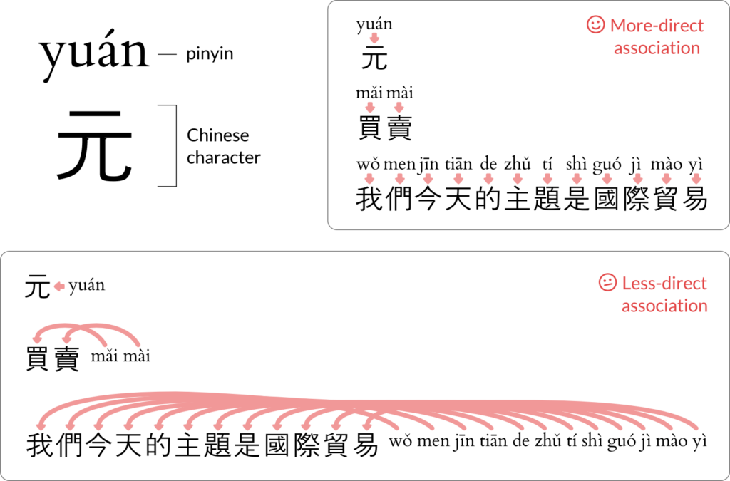
Interestingly, depending on the subject matter, the placement of labels is not trivial. Chinese writing is in the form of characters (glyphs) with pronunciations that are memorized but initially learned as pinyin (phonetics). Placing pinyin above each character is better for learning than the sequential placement of characters followed by pinyin (Ayres & Sweller, 2021) (Figure 2). By placing pinyin above (or perhaps below) each character, spatial contiguity is established when there is proximity between pinyin and character. However, the sequential placement requires the learner to take additional steps to search and associate mentally the character with the pinyin.
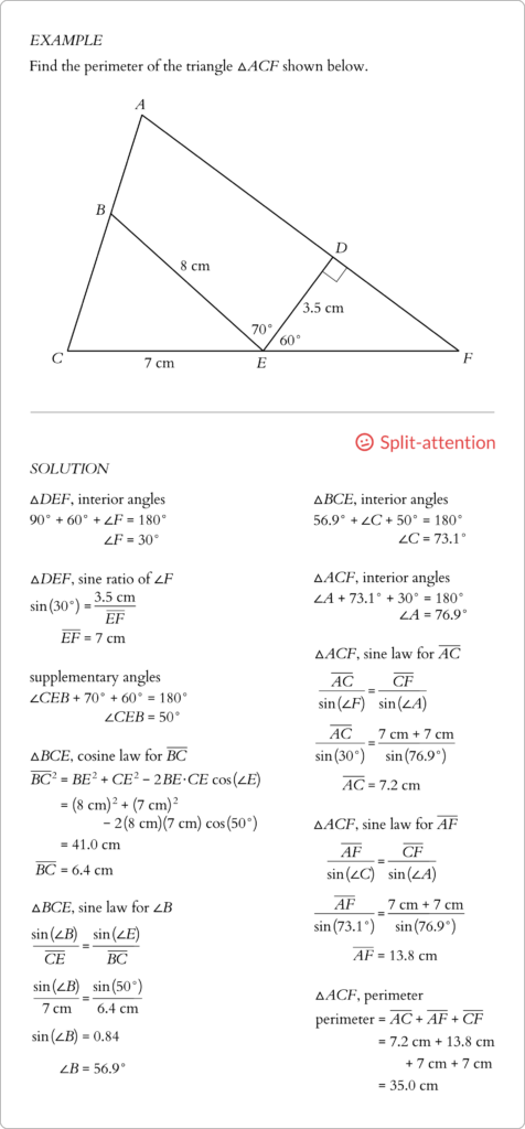
In geometry lessons, there is a potential for split-attention when segregating the calculations from the image (Figure 3) in a worked example (Ayres & Sweller, 2021). The viewer’s attention shifts repeatedly between the triangle and the calculations in order to see where the calculations fit within the context of the triangle.
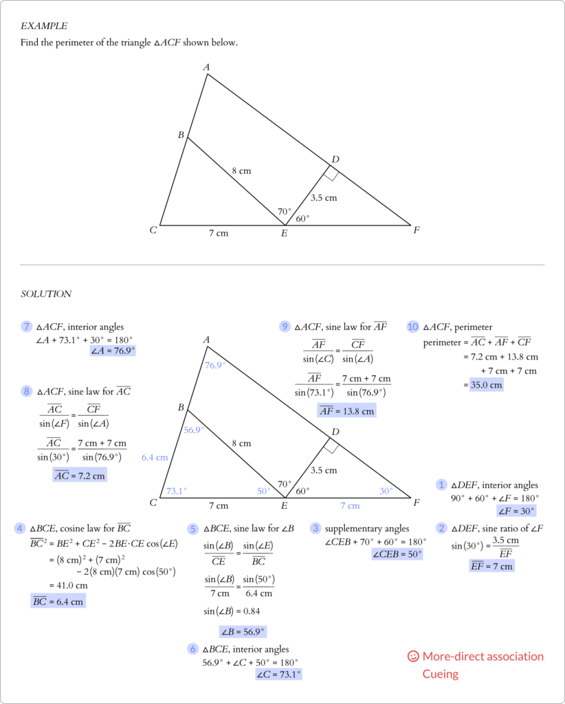
Instead, try displaying the calculations near the relevant part of the image. The calculations in Figure 4 are located close to the angle or side of interest. Admittedly, space constraints may limit how close the calculations can be to the image without the overall picture looking awkward.
The Cueing (Signalling) Principle
Implementing cues is another way of improving communication through images. As per the cueing (signalling) principle (van Gog, 2021), cues assist the viewer in interpreting an image by guiding the viewer’s attention to the relevant aspects of the image or to organize the information in the image.
Cues can take on multiple forms, including:
- colour-coding
- tonal variation (light versus dark, greyscale)
- sequencing by numbers or letters
- connectors (lines, arrows, etc.)
- text appearance (monospace, serif/sans serif, bold, italic, underline, etc.)
For viewers who cannot see colour, an alternative to colour-coding is shading (tonal variation). However, even with colour-coding, there may be differences in tone without the need to see colour. Use the greyscale option on an image editing software to check visually whether the colour-coding or shading scheme has sufficient contrast to be discernable.
The same worked example from Figure 3 now has a revised solution (Figure 4) that has numbers to cue the sequence of calculations to solve the question. The sequence is important because the solutions from previous steps are necessary for the calculations in subsequent steps. Without cues, showing all the calculations simultaneously on a page may overwhelm and confuse the learner because it is not obvious how to start solving the problem and which steps to take next. Additionally, solutions from the calculations are shaded and plotted directly into the triangle but in a different colour and tone to distinguish from the values that are given originally in the problem.
While cueing is useful to integrate text and image, cues can also be used within blocks of text, which can be seen in lessons about computer coding. The monospace typeface denotes words that the student should interpret as computer code, Figure 5. Moreover, computer code can be colour-coded manually by the course developer or automatically by the integrated development environment (IDE) to assist in interpreting the code visually.
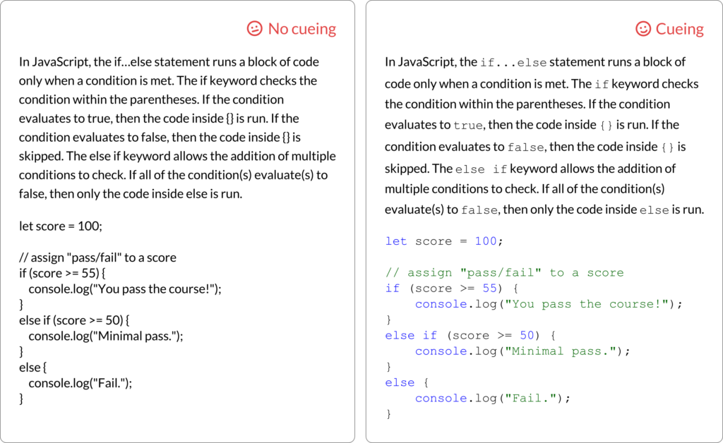
if…else statement.) A paragraph that explains how to write in JavaScript computer code is followed by a sample block of code. Two versions of the text are shown for comparison. The left panel is written entirely in a single typeface and in black text. The right panel has text in a monospace typeface to signal to the reader that the text is referring to computer code and should not be interpreted according to English language rules. In the block of code, keywords and numbers are in blue, and strings and comments are in green.Emotional Design
A fun aspect of course development to think about is emotional design. The rationale is that positive emotions can improve memory and attention (Derryberry & Tucker, 1994; Isen et al., 1978) and enhance problem-solving, negotiation, and decision-making (Isen et al., 1987). In one study about a lesson on immunizations, round shapes and warm colours improved comprehension and transfer compared to square shapes and neutral colours (Um et al., 2012). Thus, students seem to react positively to images with round shapes and warm colours.
Summary
- Place images close to where the images are referenced in the main text.
- Add labels to images to highlight the relevant information.
- Enhance the readability of images and text with cues, such as numbers, colour, tone, connectors, and text appearance.
Media Attributions
The featured image is “Self-portrait” by Vincent van Gogh (1889) [via Wikimedia Commons, public domain], modified by Jung-Lynn Jonathan Yang and licensed under a CC BY-NC-ND 4.0 license.
Unless otherwise noted, all figures were created by Jung-Lynn Jonathan Yang under a CC BY-NC-ND 4.0 license.

